Walk into any supermarket and you’ll see hundreds of products competing for attention. Most shoppers decide what to pick up in just a few seconds. That means your label has a very small window to make an impact.
If you want to create standout food and beverage labels, you need more than a nice logo and bright colors. You need strategy, clarity, and the right materials working together.
Here are 7 practical tips that will help your product stand out, and stay memorable.
1. Understand Your Target Audience First
Before you choose colors, fonts, or finishes, ask one important question: who are you designing for?
A premium organic olive oil brand should look very different from an energy drink targeting college students. Your label needs to reflect the lifestyle and expectations of your audience.
Consider:
- Are they health-conscious?
- Do they prefer bold, playful branding?
- Are they buying for value or for quality?
- Are they shopping in specialty stores or mass retailers?
When you understand your customer, you can make smarter design decisions. If you skip this step, your label may look good but not convincing.
2. Keep Your Design Clear and Focused
One of the biggest mistakes brands make when trying to create standout food and beverage labels is overloading the design.
They use too many colors, fonts and too much text.
Your label needs a clear visual hierarchy:
- Brand name
- Product name
- Key benefit or differentiator
Everything else supports those elements.
White space is not an empty space. It creates a breathing room and improves readability. A clean design often looks more premium and trustworthy than a crowded one.
If shoppers can’t quickly understand what your product is, they’ll move on.
3. Use Color Strategically
Color influences perception instantly.
Green often signals organic or natural ingredients. Red can suggest a bold flavor. Blue may feel clean or refreshing. Black and gold can communicate premium quality.
But color isn’t just about emotion, it’s about visibility. Your label needs contrast, so it stands out on a crowded shelf.
Look at competitors in your category. If every kombucha brand uses pastel tones, a bold contrast might help you stand apart. If energy drinks dominate with neon colors, a clean minimalist approach might differentiate you.
To create standout food and beverage labels, color choices must support both brand personality and shelf visibility.
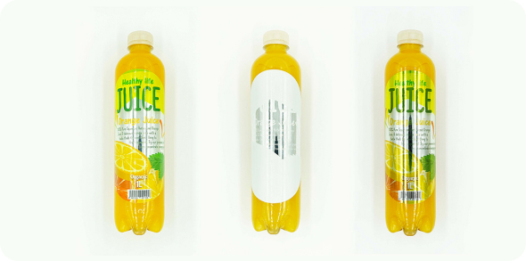
4. Choose the Right Label Material
Design matters but performance matters just as much.
A beautiful label that wrinkles in the fridge or peels off in moisture won’t protect your brand.
Food and beverage products often face refrigeration, condensation, oil exposure, freezing temperatures.
Paper labels may work well for dry goods. Film materials often perform better for beverages and refrigerated products. Waterproof or oil-resistant options protect durability. Understanding those differences is essential when selecting the right beverage label material.
The material you choose affects not only function but also perception. Gloss film can feel modern and vibrant. Matte paper can feel natural and artisanal.
When you want to create standout food and beverage labels, durability and design must work together.
5. Use Typography That’s Easy to Read
Typography should support your brand, not compete with it.
Decorative fonts may look interesting, but if shoppers can’t read your product name quickly, you lose attention.
Stick to:
- Clear headline fonts
- Legible ingredient text
- Strong contrast between text and background
Food and beverage labels also include required information like ingredient lists and nutrition facts. These sections must remain readable and compliant with regulations.
Test your design at actual size. What looks clear on a large screen may become difficult to read when printed on a small bottle.
6. Highlight Key Benefits Clearly
Consumers scan labels. They don’t read them fully.
If your product is organic, gluten-free, non-GMO, sugar-free. high protein, make those benefits easy to spot.
Use simple callouts or icons without overwhelming the design. Badges and small visual markers can draw attention without adding clutter.
The key is balance. Too many claims weaken your message. Focus on what truly differentiates your product.
Strong communication helps create standout food and beverage labels that don’t just look good, they sell.
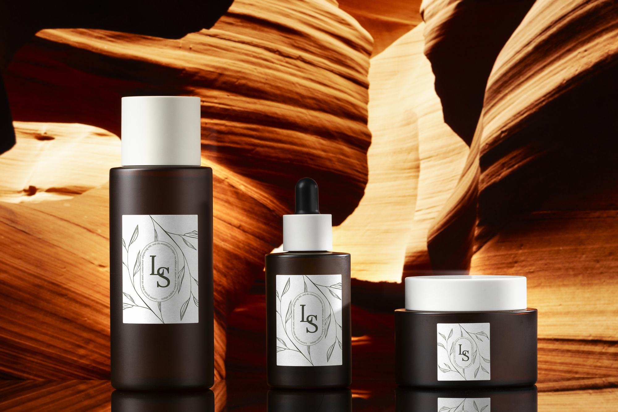
7. Don’t Ignore Finishing Details
Finish plays a big role in how your product feels in someone’s hand.
Matte finishes create a soft, modern look. Gloss finishes enhance color vibrancy. Foil accents can add a premium touch. Soft-touch laminations create texture.
Finishing isn’t decoration. It influences perceived value.
A small beverage startup can elevate its shelf presence simply by choosing a finish that aligns with its brand positioning.
When you create standout food and beverage labels, finishing details often make the difference between “nice” and “memorable.”
Conclusion
To create standout food and beverage labels, you need more than a creative idea. Your label is often the first interaction customers have with your brand. It influences trust, quality perception, and purchasing decisions in seconds.
When design strategy and professional printing come together, your product doesn’t just blend into the shelf, it commands attention.
If you’re developing a food or beverage product and want guidance on materials, finishes, and production options that support your design, working with an experienced label printing partner can help you bring your vision to life without costly mistakes.
Because great products deserve labels that stand out and perform just as well as they look.
FAQ
Strong visual hierarchy, clear branding, strategic color use, and durable materials help create standout food and beverage labels. Products that communicate their value quickly and clearly tend to capture attention faster than cluttered designs.
Printing sample labels allows you to check color accuracy, readability, adhesion, and overall presentation. Testing helps avoid costly reprints and ensures your design performs in real-world conditions.
Film materials are often best for beverage labels because they resist moisture, condensation, and refrigeration. Paper labels may work well for dry goods, but beverages typically require waterproof or oil-resistant options to maintain durability.
Finish plays a major role in perception. Matte finishes can create a natural or premium feel, while gloss finishes enhance color vibrancy. Foil accents and specialty laminations can elevate a product’s shelf presence and help create standout food and beverage labels.