Three forces are reshaping what a cosmetic label looks like this year, and they pull in slightly different directions at once: brands want labels that say less visually while still standing out, packaging is under real regulatory pressure to become more sustainable, and shoppers still expect a product to feel premium in hand. Getting all three right on one label — clean, compliant, and high-end — is a genuinely harder design brief than it was a few years ago. Here’s what’s actually changing, and what it means for a brand planning label orders this year.
Minimalist Design Is Replacing Maximalist Branding
Clean layouts, restrained color palettes, and simpler typography are showing up across cosmetics and skincare label design, largely because minimalism has become shorthand for “clean,” trustworthy, and confident branding — a visual cue that the product doesn’t need to shout to prove itself. That’s a shift from the more decorative, pattern-heavy label design that dominated the category for years.
The tricky part of this trend is that minimalist doesn’t mean simple to produce. A label with very little on it puts more pressure on every remaining element — typography, spacing, finish — to look intentional rather than unfinished. Our guide to luxury cosmetic labels and how texture and finishes elevate brand perception covers how brands use finish rather than visual complexity to carry that premium feel when the design itself is stripped back.
Sustainability Is Becoming a Label Requirement, Not Just a Preference
Sustainable packaging has moved from a marketing angle to a compliance issue in a growing number of markets. Several U.S. states — including California, Oregon, Colorado, and Maine — have already enacted extended producer responsibility (EPR) laws that place packaging recyclability requirements and costs on brands and manufacturers. In the EU, Regulation 2025/40 (the Packaging and Packaging Waste Regulation) introduces binding sustainability requirements for packaging, with key provisions taking effect starting in August 2026. Brands selling into these markets increasingly have to treat packaging and label material choices as a compliance decision, not just a brand-values one.
For labels specifically, this shows up in a few ways: a shift toward recyclable or post-consumer recycled (PCR) label materials, and closer attention to whether the label and its adhesive interfere with recycling the container itself. A label made from an incompatible material, or an adhesive that doesn’t cleanly release during the recycling process, can contaminate an otherwise recyclable container — which is why some brands are moving toward mono-material packaging systems where the container, cap, and label are all compatible with the same recycling stream. Our sustainable label printing guide goes into more detail on what “sustainable” actually means at the label level.
One caution worth building into any 2026 label refresh: vague sustainability language on packaging invites scrutiny. Specific, verifiable claims (“made with 30% post-consumer recycled content,” for example) tend to hold up better than generic language like “eco-friendly,” both with regulators and with increasingly skeptical consumers.
Premium Finishes Are Doing More of the Work Visually
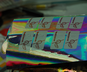
With less going on in the base design, finish has become one of the primary ways cosmetic brands signal quality on shelf. Foil stamping, embossing, soft-touch coatings, and spot UV accents are all seeing more use — not layered on top of a busy design, but applied deliberately to a small number of elements against a clean background, which tends to make the effect more noticeable rather than less.
This also means the choice between finishing techniques matters more than it used to. Foil stamping and metallic ink printing achieve a visually similar effect through different processes with different cost and durability tradeoffs — see our comparison of foil stamping vs. metallic ink printing for how to choose between them. Similarly, the decision between a matte or gloss lamination affects how a minimalist design actually reads under store lighting — our matte vs. gloss lamination guide covers that tradeoff in more depth.
Clear and Transparent Labels Continue Gaining Ground
The “no-label look” — where a clear label lets the container and product show through around the printed design — keeps showing up in cosmetics and skincare specifically, since it pairs naturally with the minimalist trend: less visible label surface, more product visibility. We covered how this effect is actually achieved, including the white ink underprint technique that makes it work, in our guide to clear and transparent labels.
Smart and Connected Labels Are Showing Up on Cosmetics Too
QR codes are increasingly appearing on cosmetic and skincare labels — often for ingredient sourcing transparency, sustainability information (recycling instructions, refill program details), or authentication on higher-price products prone to counterfeiting. This fits into the broader shift toward connected packaging, and it’s a practical way to keep a minimalist physical label uncluttered while still giving customers access to more information than the label itself has room for.
What This Means for Brands Ordering Labels in 2026
Pulling these trends together into an actual label order means planning several decisions together rather than picking a design first and figuring out production details later:
- A minimalist design still has to fit all required ingredient, warning, and compliance information — which often means the “clean” look depends on smart use of space and typography, not just leaving things off the label.
- A sustainability commitment on the label (material, PCR content, recyclability claims) needs to be something the brand can actually verify and stand behind, not just implied through green colors or leaf icons.
- A premium finish decision (foil, emboss, soft-touch, spot UV) needs to be chosen alongside the base material and design from the start, since not every finish is compatible with every substrate or budget.
- If sustainability is a priority, the label material and adhesive need to be evaluated for compatibility with how the container itself gets recycled — not treated as a separate decision from the container.
A Practical Checklist for 2026 Cosmetic Label Planning
- Does the design balance minimalism with all required regulatory and ingredient information?
- Are any sustainability claims specific and verifiable, rather than vague or implied?
- Does the label material and adhesive support the container’s recyclability, if that’s a priority?
- Is at least one finish technique (foil, emboss, soft-touch, spot UV) being used deliberately to reinforce quality, rather than layered on without a clear purpose?
- If a clear or “no-label” look is being considered, has a white ink underprint been planned into the design file from the start?
- Would a QR code add real value here (ingredient transparency, authentication, sustainability info), or would it just clutter an otherwise clean design?
Getting Started
Most of these trends aren’t about picking one design style. They’re about planning material, finish, and compliance decisions together instead of treating them as separate steps late in the process. Quadlabels works with cosmetic brands on custom label materials and finishes, including sustainable and clear label options, suited to how a specific product will actually be produced, shipped, and displayed. Sign up to our online ordering portal and place your cosmetic labels order.