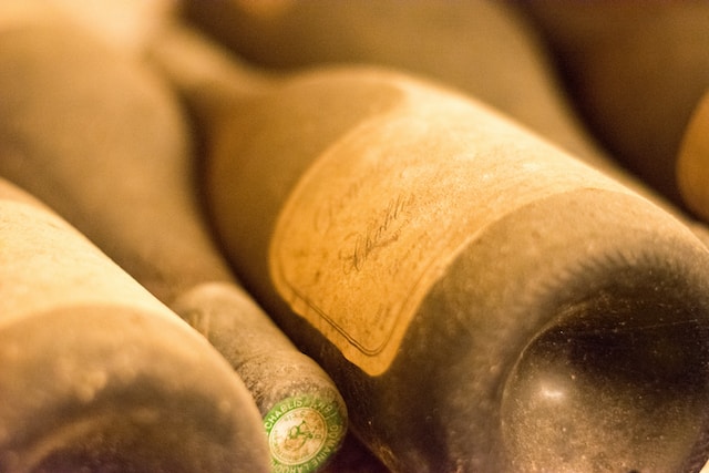
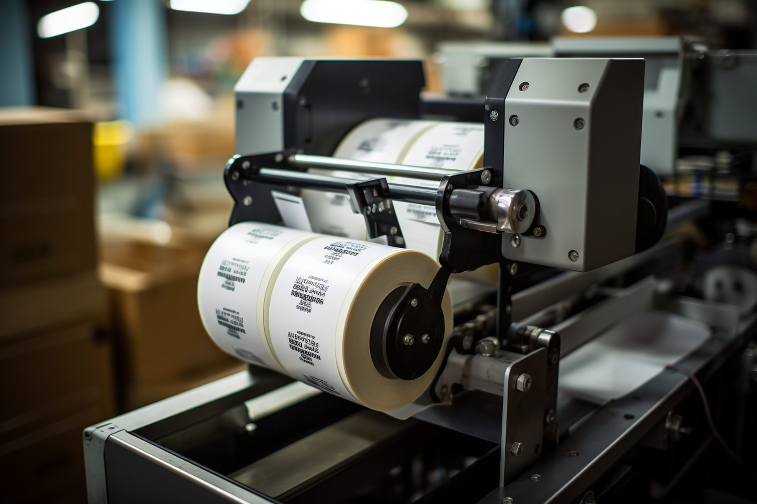
Walk down almost any premium beverage, olive oil, or skincare aisle and you’ll notice the same visual trick repeating. The label seems to disappear, and the printed design looks like it’s floating directly on the glass or plastic. That’s not a special printing process. It’s a clear label, applied well. Getting that effect right, though, takes more than just switching from white stock to a transparent one. The material, the ink, and the design file all have to work together, or the result looks unfinished instead of premium.
What Is the “No-Label Look”?
The “no-label look” describes packaging where the label itself is visually minimized or hidden, so the printed graphics appear to sit directly on the container. Instead of a visible white or colored rectangle wrapped around a bottle, only the ink shows. Logos, text, and design elements seem to float against the product or the glass behind them.
It’s achieved with a transparent label substrate rather than any kind of special coating or post-printing treatment. The film itself is clear; what makes the design visible is selective printing on top of it.
How Clear Labels Actually Create the Effect
A completely transparent film with ink printed directly on it doesn’t automatically look clean. Two things determine whether a clear label reads as polished or messy: the finish of the film, and how the artwork handles opacity.
Finish options. Clear label film generally comes in a few finish variations:
- Fully transparent (gloss clear) — maximum see-through effect, closest to true invisibility where there’s no print
- Frosted or matte clear — a soft, diffused transparency that mutes the background slightly, often used for a more subtle, premium look rather than full see-through
- Translucent/semi-opaque clear — lets some light and color through without being fully see-through, useful when the container’s contents aren’t visually appealing enough to showcase directly
White ink underprint. This is the part that trips people up most. On a clear film, any ink is inherently translucent. It lets the background show through, the same way a colored film would. White ink printed directly on clear film without a backing layer is essentially invisible, and other colors printed without a white base will look muddy, dull, or shift depending on what’s behind the label (dark glass, a colored liquid, a metal cap).
The fix is a white ink underprint: a layer of opaque white ink printed first, beneath the visible artwork, only in the areas where full color accuracy is needed. Everywhere else, the film stays transparent. Done well, this creates a label where the design pops in full color and true white, while the unprinted areas genuinely disappear against the container.
Materials Used for Clear and Transparent Labels
Clear labels are most commonly produced from either clear BOPP (biaxially oriented polypropylene) film or clear PET (polyester) film. Both are synthetic plastic films rather than paper, since paper can’t be made truly transparent.
Clear BOPP tends to be the more common, cost-effective choice for general product labeling. It also pairs well with the flexibility needed for curved bottles and jars.
For a fuller explanation of what BOPP is and how it behaves, see our guide to BOPP Labels.
Clear PET is typically stiffer and offers slightly better clarity and dimensional stability. This can matter for very precise, high-end packaging or applications with more demanding durability requirements. It often comes at a higher cost than clear BOPP.
For most product brands choosing between the two, the decision usually comes down to the shape of the container (PET is less forgiving on tight curves), the budget, and how critical absolute optical clarity is to the final look.
Key Design and Print Considerations for the No-Label Look
A clear label design file works differently than a standard opaque label file. A few details make the difference between a clean result and a disappointing one:
- Decide deliberately where the film stays transparent. Every area without ink will show the container and its contents behind it. That’s the effect you want. But it means the product itself (liquid color, fill level, glass tint) becomes part of the design.
- Use a white ink layer wherever true color or white is needed. Skipping this step is the most common reason clear labels look washed out or inconsistent.
- Keep contrast and legibility in mind. Small text or fine details can be hard to read without a solid background behind them. Minimum type sizes matter more on transparent labels than on opaque ones.
- Define label boundaries intentionally. Without a visible edge, a label with no clear die-cut shape or border can look like an unfinished sticker rather than an integrated design. A clean die-cut shape, even an irregular one that follows the artwork, usually reads better than a plain rectangle.
- Test under real lighting. Clear labels can behave differently under store lighting, direct sun, or product photography than they do on a screen. Glare and reflections show up more than they would on a matte, opaque label.
Where the No-Label Look Works Best
Clear labels tend to work best on smooth, uniform surfaces like glass and smooth rigid plastic. Texture or an uneven surface interferes with how cleanly the transparent film adheres and how consistent the see-through effect looks. A few categories where this shows up often:
Olive oils, spirits, and craft beverages often use the no-label look because the product’s color and clarity are part of the appeal. A clear label lets the liquid itself contribute to the shelf presentation instead of hiding it behind an opaque wrap.
Cosmetics and skincare frequently use transparent labels on glass jars and bottles for a minimalist, premium aesthetic, especially when the product’s texture or color is part of the brand story.
Candles in glass jars often use clear labels so the wax color and any visible wick or botanicals show through, rather than being covered by a full-wrap opaque label.
Personal care and beverage bottles with distinctively shaped or colored glass sometimes use clear labels specifically to avoid covering up the container design the brand paid to develop in the first place.
The pattern across all of these: clear labels make the most sense when the product or container itself is visually appealing and worth showing off. If the contents look inconsistent (uneven fill lines, ingredient settling, a plain or unattractive container), an opaque label is usually the safer, more consistent choice.
Clear Labels vs. Opaque Labels: Which Is Right for Your Product?
Clear and opaque (white) labels aren’t competing on durability or print quality. Both can use the same base film and printing process. The real difference is what the label needs to do for the product visually.
Visibility of contents: Clear labels showcase the product; opaque labels hide it. This matters if fill consistency, sediment, or product color varies between batches. A clear label makes those variations visible to the customer, which isn’t always desirable.
Design flexibility: Opaque white labels give a consistent, predictable background for full-color graphics with no extra planning. Clear labels require the added step of a white ink underprint to get the same color accuracy. This typically means more setup and sometimes more cost.
Brand positioning: Clear labels tend to read as premium, minimalist, or artisanal. Opaque labels can look just as premium, but through a different visual language — bold color blocks, foil, or texture rather than transparency.
Cost: Because of the added white ink layer and often more demanding print registration, clear labels can run somewhat more expensive to produce than an equivalent opaque label — worth factoring in for large orders.
Neither option is objectively better. A brand selling a beautifully clear spirit in a well-shaped bottle has a strong case for a clear label. A brand selling a product with inconsistent fill levels or an unremarkable container is often better served by opaque, full-coverage branding.
Common Challenges With Clear Labels and How to Avoid Them
Clear labels are less forgiving of application and print issues than opaque ones, simply because there’s nothing to hide behind:
- Air bubbles and wrinkles are more visible. On an opaque label, minor application imperfections are easy to miss. On a clear label, they show clearly against the product underneath. Careful, consistent application matters more here than on standard labels.
- Adhesive residue or haze can be more noticeable. Choosing an adhesive designed for clear applications helps avoid a cloudy or hazy appearance at the label edges over time.
- Glare and reflections during photography. Product photography for e-commerce listings can pick up more glare from a glossy clear label than from a matte opaque one. A frosted or matte clear finish sometimes photographs more consistently.
- Text and fine detail can become hard to read. Without a white ink backing plan built into the design from the start, small text or thin lines are the first thing to disappear or blur.
Most of these issues come down to planning the design and material together rather than treating the artwork and the substrate as separate decisions.
Is the No-Label Look Right for Your Product?
A few questions help settle the decision:
- Is the container itself (glass shape, liquid color, product texture) something worth showing off?
- Is fill level or product consistency reliable enough to be visible through a clear label?
- Does the brand want a minimalist, premium aesthetic rather than bold, full-coverage graphics?
- Is the surface smooth and consistent (glass or smooth rigid plastic), rather than textured or uneven?
- Is there budget and design time to properly plan a white ink underprint rather than a standard color file?
If most of these point toward “yes,” a clear label is likely to deliver the effect you’re after. If not, an opaque or white BOPP label may achieve a stronger, more consistent result for less complexity.
Getting Started With Clear and Transparent Labels
The technical details — clear BOPP versus clear PET, which finish to choose, how much white ink underprint the design needs, and adhesive selection for the container material — are easiest to get right when they’re planned alongside the artwork rather than after it’s finished. A label printer can advise on which substrate and finish will hold up best for a specific container shape and use case.
Quadlabels offers custom clear and transparent label printing across BOPP and other materials, with finish and adhesive options suited to glass jars, bottles, and a range of smooth packaging surfaces. You can place an order by visiting our online ordering portal.
FAQ
It’s a packaging style where the label appears nearly invisible, so printed graphics look like they sit directly on the container. It’s achieved using a clear or transparent label film rather than a standard opaque one.
For any area of the design that needs accurate color or true white, yes. Without a white ink underprint beneath the artwork, colors on a clear label can look muddy or shift depending on what’s behind the label, and white elements become invisible.
Clear BOPP is one common material used to make clear labels — a transparent version of biaxially oriented polypropylene film. Clear labels can also be made from other clear films, such as clear PET, depending on the durability and clarity needed.
It tends to work best on smooth glass or plastic containers where the product itself — its color, clarity, or texture — adds to the shelf appeal, such as spirits, olive oil, skincare, and candles in glass jars.
Often somewhat, yes. The added white ink underprint step and the more precise print registration clear labels can add cost compared to a standard opaque label using the same base material.